ShopDreamUp AI ArtDreamUp

Deviation Actions


Description
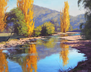
This one took me almost a month to complete... Frustrated with the new Art Spectrum Colourfix Suede surface which appears so yummy, but can't hold more than 1.5 layers of pastel OR pencil, I dropped the twice-started project and began a new one, on a cheap Dollarama Bristol board that happened to be toned the EXACT shade of medium blue I needed for this painting.
Used mostly Sennelier and Schmincke pastels with a wee bit of NuPastel and Unison (I'm beginning to suspect that the hard pastels are pretty much too hard to work on non-sanded surfaces...)
And of course, there was a colour shift toward the red (?) when I printed out the reference pic...
Reference photo by the very talented Ivan Andreevich: [link]
Thank you all so much for your wonderful comments, your support means a lot to this aspiring artist! <3
Image size
3791x2629px 2.39 MB
Make
Canon
Model
Canon PowerShot SX220 HS
Shutter Speed
1/125 second
Aperture
F/4.5
Focal Length
15 mm
ISO Speed
250
Date Taken
May 4, 2013, 5:11:53 PM
Sensor Size
6mm
© 2013 - 2024 LuthienneTinuvielle
Comments29
Join the community to add your comment. Already a deviant? Log In
Wow, how large is the paper you used? The amount of detail this painting has is absolutely amazing. I assume you used pastel pencils to draw the little things, because I personally find soft pastels unfit for details like that, especially if it is a smaller size drawing/painting. I spend a week or so painting mine - long time too. And recently I've been thinking whether it's worth taking this long to produce a copy of a photograph. I also used reference photos I took myself. Although the feedback has been great, I realize that I would rather spend less time on a painting not to lose the freshness, and instead focus on contributing something new to the painting that is not found on the reference photo, e.g. by using a limited colour palette, or unusual mark making. This isn't a criticism of working in a certain way, instead I wanted to share my thoughts on this topic that we seem to approach in a similar way.  (Smile)") I'd be interested to hear yours as well.
I'd be interested to hear yours as well.